
While completing an Ember Shepherd integration, to create a custom site tour, for a recent client, I began thinking about the different ways that applications can present tours to new users, and I noticed that two patterns seem to be the most predominant across the Web: Slideshows and Safaris.
Each of these patterns has a different set of pros and cons, and each has a drastically different set of UX ramifications for end users. With that in mind, I thought it would be worthwhile to break down exactly that. Hopefully, it can help inform the way we approach future integrations here at Ship Shape, while also serving as a guide to anyone who might be on the fence about their own product designs.
The Slideshow
🔑 Main Idea
Dim the lights and display a single, center-fixed modal with controls for sliding through a collection of inner views.
🛠 What Impact Does it Have?
Being a flavor of the modal dialog pattern, this kind of site tour is used when you want to put the rest of the app on hold, and fixate users on a collection of views that they can slide through one-at-a-time. While it might seem limiting for… you know… a “tour”, a single modal encompassing much of the screen can still be a rich design space for displaying text, screenshots, and even videos to show off the underlying app. The tour for Google Inbox (RIP) does this well:
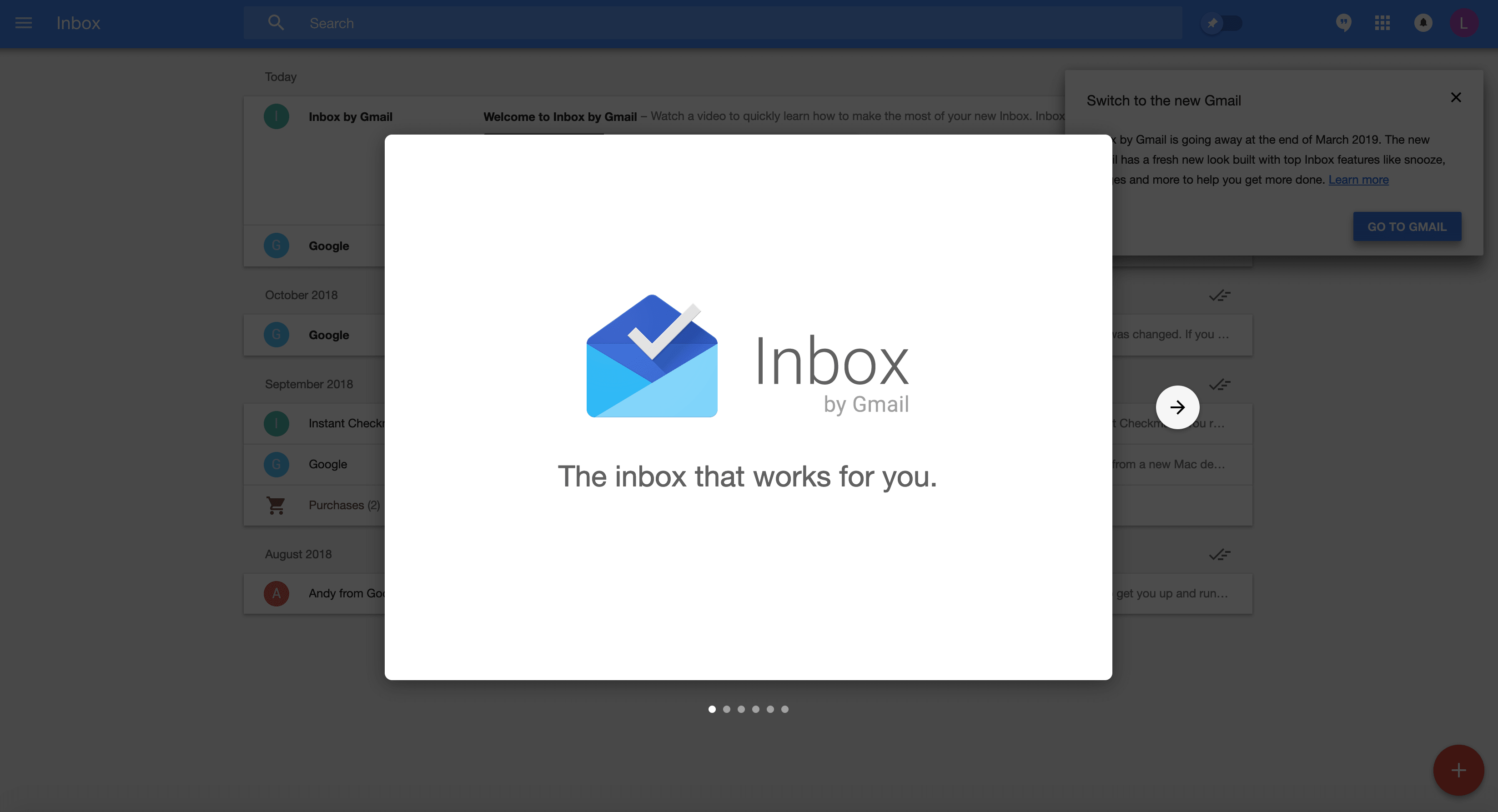
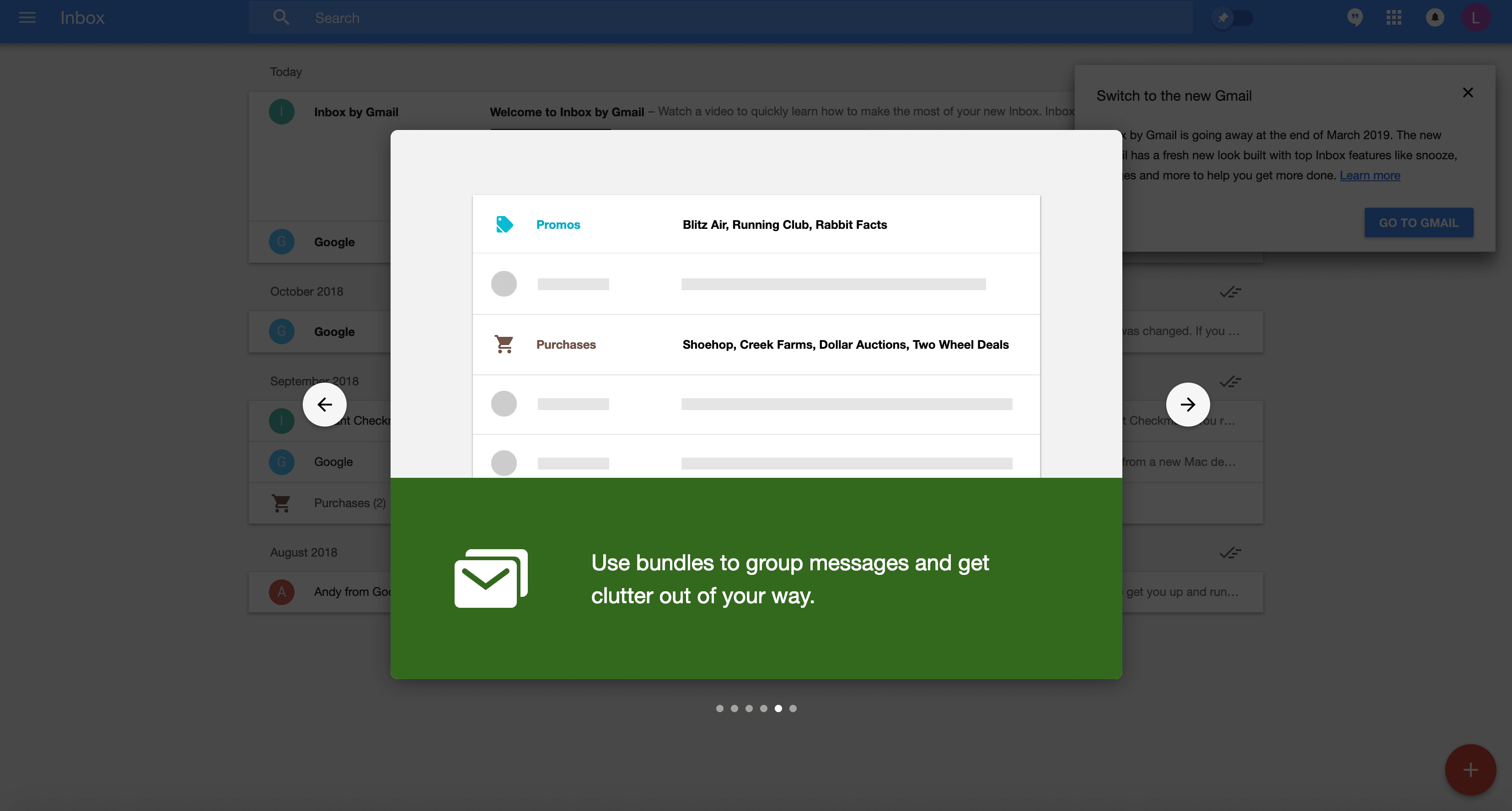
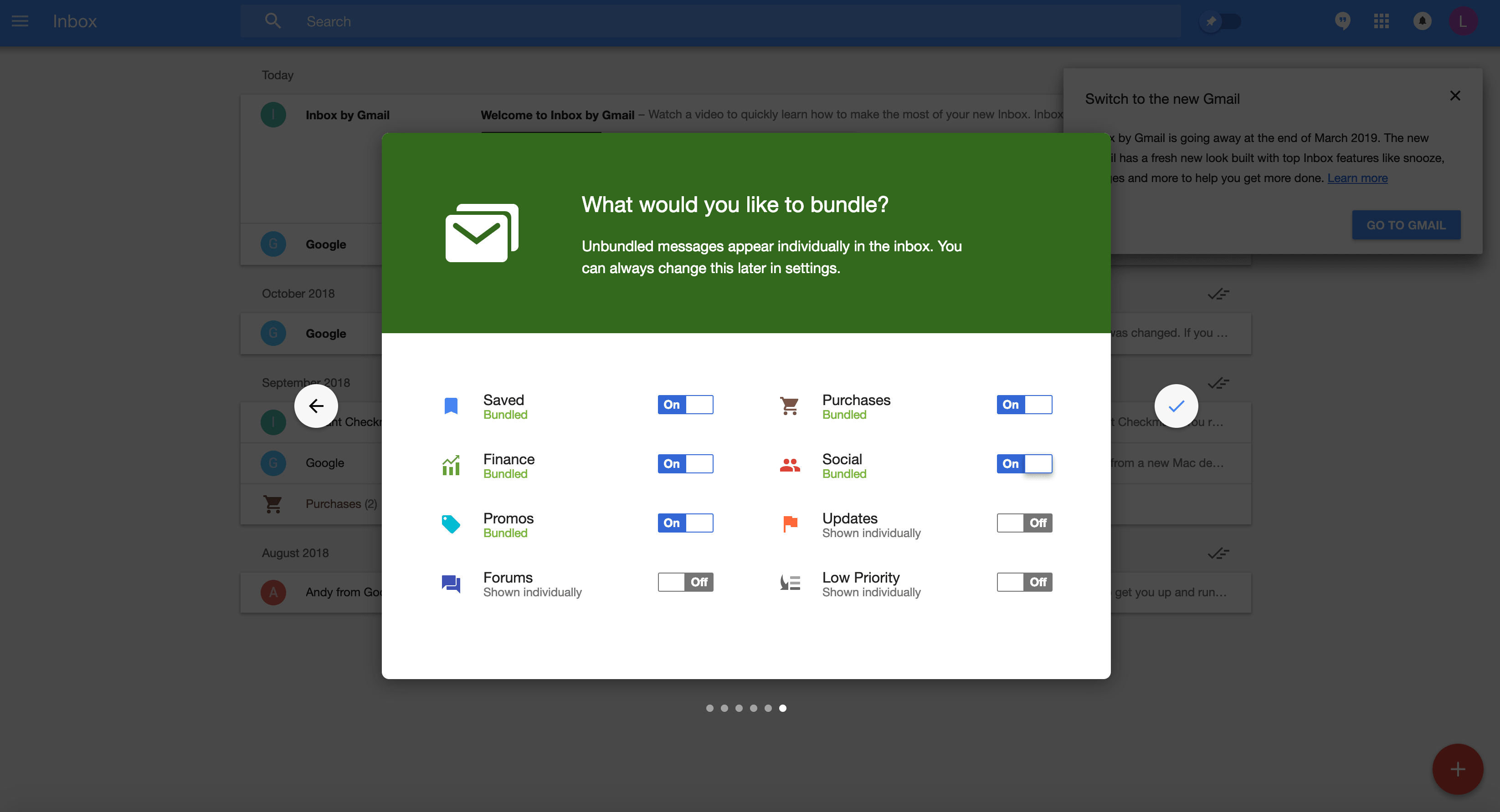
This experience tones down what could otherwise be a blast of information for new users to process, distilling it into simplified, segmented views that still preview different portions of the application. It even concludes by allowing users to set some initial preferences, for the product they’re about to start using in full. It doesn’t quite capture the “complete” Inbox experience, but that’s arguably not the point. It communicates ideas, and prepares users to capture the experience through their own use.
Furthermore, from the standpoint of development, this pattern is a cinch to implement. The tour is completely decoupled from the underlying application, its markup, its code, its visual aesthetic, and it can be updated as needed to highlight new site features and functionality.
⚖️ Summary
➕ Pros
- More control
- More rapid to develop
- More straightforward to refactor
- Less risk of coupling with (and thus, introducing side-effects to) the underlying app.
➖Cons
- Doesn’t capture the full experience
- Might not engage users as much — they’re not forced to explore certain functions.
The Safari
🔑 Main Idea
Take users straight into the wilderness of your app as it runs, guiding them with pointers (aka tooltips) for each step.
🛠 What Impact Does it Have?
Full Immersion. Learning by Doing. Trial by Fire. Whatever your philosophy is, there will be times when your tour requires a more… intimate level of interaction with the underlying application in order to onboard new users.
Commonly, this involves building out sequences of tour “steps” where a tooltip or callout can display an instruction, while also highlighting a specific element on the page that the user needs to directly interact with.
This mode of touring creates an experience that feels more like a demo, or a trial, of the application, than a briefing (which a slideshow might exude). This can be desirable for a number of reasons:
- You need users to complete certain setup actions before using the rest of the app more freely.
- You want to demo a feature that’s significantly different in action than it is on a static slide.
- Your tour steps are context specific — they might not be shown until a user expands a dropdown or focuses on a form.
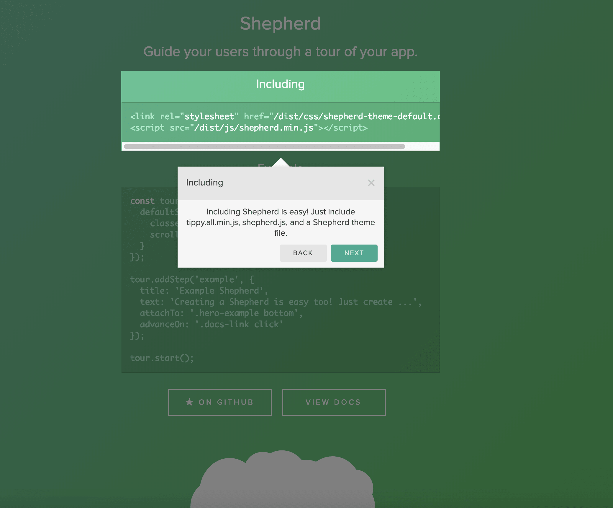
Paradoxically, tooltip-based, interactive tours can be useful when your tour is the opposite of complex. If you just need to call out a button here or a set of navigation items there, a single tour sequence with a few discrete tooltips might be all you need. The Shepherd.js demo is good example of this use case:
Alas, the safari-style tour is a slippery slope when it comes to complexity and the resources required to both integrate and maintain it going forward. It’s directly coupled to the structure of the current markup, it needs to be aware of the current application state, and it might even involve maintaining a sequence of tour steps across a series of page transitions, animations, long-living events and more. Implementing such a tour should be a careful decision that considers both your design and development requirements and resources.
It’s also a decision that Ship Shape would love to help you with. Shepherd is meant to be configurable, for any style of site tour, and we’ve developed solutions for clients who’ve needed slide shows, safaris, both, and everything in between.
⚖️ Summary
➕Pros
- Users will emerge significantly more familiar with your app.
- Engagement is required to complete the tour.
- Hands-on tours can be the tipping point of converting full adoption.
➖Cons
- Much more technical complexity.
- Harder to refactor alongside changes to the underlying app.
- Harder to maintain alongside changes to the underlying app.
- Harder to estimate complexity up front.